Development
The Next.js Image Component: A Practical Guide
Next.js's Image component handles most responsive-image best practices automatically, but it has opinions you need to know about. Here's what actually happens and when you should override it.
I’ve shipped Next.js sites since the Next 9 days. The
<Image> component has gone through three significant iterations in that time, and each
one has been a real improvement. As of Next 15, it’s genuinely one of the best default image primitives any
framework ships with.
That said — and this is where most guides stop — the component has opinions, and when you don’t know what those opinions are, it does surprising things. This guide is the “here’s what actually happens under the hood and when to fight it” version I wish I’d had when I started.
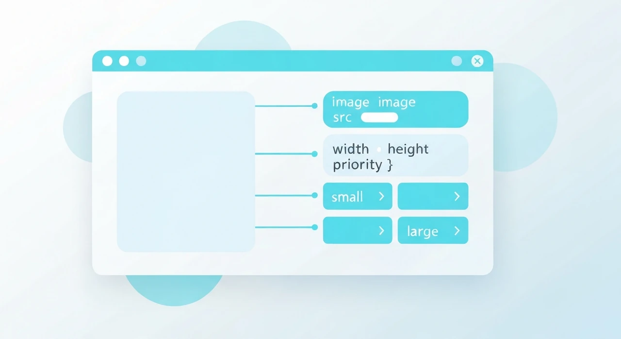
What the component does for you
When you write:
import Image from 'next/image';

<Image
  src="/hero.jpg"
  alt="Descriptive alt text"
  width={1600}
  height={900}
/>
Next.js, in the background:
- Generates multiple-resolution variants (at deployment or on-demand depending on configuration).
- Serves AVIF to browsers that accept it, WebP to browsers that accept WebP, and the original format otherwise.
-
Emits an HTML
<picture>+<img srcset>combo with the right sizes. -
Sets
loading="lazy"by default (you opt intopriorityfor LCP images). - Sets
widthandheightattributes to prevent CLS. - Applies aspect-ratio CSS to reserve space during loading.
-
Supports
placeholder="blur"with LQIP (low-quality image placeholder) that renders before the full image arrives.
That’s a lot. If you wrote this manually with
<picture> + srcset + lazy loading + LQIP, you’d be generating maybe 50 lines
of markup per image.
The two deployment modes
Next.js images work in two distinct modes, and which one you’re using changes everything.
Server/Edge mode (default for next/server runtime)
The image optimizer runs on your Next server. When a browser requests
/next/image?url=/hero.jpg&w=800&q=75, the server reads the source file, resizes to
800px, encodes to AVIF/WebP/JPG based on the Accept header, and returns the result.
This is the default and most flexible mode. It works with any deployment target that runs Node.
Static export mode
When you use next export or the static-output configuration, there’s no runtime server to
process images. The image optimizer can’t work. You have two options:
- Use a third-party loader. Tell Next.js to delegate optimization to an external service (Cloudinary, imgix, Cloudflare Images). The component emits URLs pointing to the loader.
-
Use
unoptimized. Skip image optimization entirely and serve the original files. Loses most of the component’s benefits but works everywhere.
For a Jamstack site deployed to Vercel, Netlify, or Cloudflare Pages, server mode works because those platforms run the optimizer on their edge workers.
The priority prop: when to use it
priority does three things:
- Sets
fetchpriority="high"so the browser prioritizes downloading this image. - Disables lazy loading (the image is eager).
-
Adds a
<link rel="preload">to the page<head>so the browser discovers it earlier.
Use it on the LCP image. Typically that’s the hero of your homepage, the featured image of a blog post, the main product photo of a product page. One per page, usually.
Do not use it on images below the fold. Every
priority image competes for early bandwidth and can actually hurt LCP by delaying the real LCP
element.
The sizes prop: the one you need to set
The component generates multiple resolution variants, but it needs to know the displayed size to
pick the right variant. That’s what sizes tells it.
The default (if you don’t set sizes): 100vw. The browser assumes the image takes the full
viewport width, which downloads a larger variant than necessary for anything that isn’t full-width.
For an image inside a max-width-800px container:
<Image
  src="/post.jpg"
  alt="..."
  width={800}
  height={450}
  sizes="(max-width: 800px) 100vw, 800px"
/>
For a 3-column grid on desktop:
<Image
  src="/card.jpg"
  alt="..."
  width={400}
  height={300}
  sizes="(max-width: 640px) 100vw, (max-width: 1024px) 50vw, 33vw"
/>
If you ignore sizes, your images will “work” but will waste bandwidth. The component doesn’t
warn you. You have to remember.
The fill mode
For images that should fill their container rather than have fixed dimensions, use fill:
<div style={{ position: 'relative', aspectRatio: '16 / 9' }}>
  <Image src="/hero.jpg" alt="..." fill sizes="100vw" />
</div>
The parent must be position: relative (or absolute, or fixed). The sizes prop is
still required.
This mode is right for responsive hero images where the aspect ratio is fixed but the pixel dimensions scale with the viewport. I use it for blog post heroes.
Blur placeholder: worth it?
placeholder="blur" shows a small blurry version of the image while the full one
loads. For the blur data, you have two options:
-
Static imports.
import hero from '../public/hero.jpg'and usesrc={hero}. Next.js generates the blur data at build time automatically. -
Manual
blurDataURL. Pass a base64-encoded LQIP (low-quality image placeholder) yourself.
The blur looks nice for hero images where the image takes a noticeable moment to load on slow connections. For small thumbnails, it’s overkill.
For external images (not statically imported), you’d need to generate blur data server-side. Libraries like
plaiceholder can do this.
The quality prop
Default is 75. Set it per-image if needed:
<Image src="/hero.jpg" alt="..." width={1600} height={900} quality={85} />
I go higher (85) for visually critical hero images and leave the default for everything else. Going above 90 rarely justifies the file-size cost.
Configuring the optimizer
Most tuning happens in next.config.js:
module.exports = {
  images: {
    formats: ['image/avif', 'image/webp'],
    deviceSizes: [640, 750, 828, 1080, 1200, 1920, 2048, 3840],
    imageSizes: [16, 32, 48, 64, 96, 128, 256, 384],
    minimumCacheTTL: 60 * 60 * 24 * 365, // 1 year
    remotePatterns: [{ protocol: 'https', hostname: 'images.example.com' }],
  },
};
-
formats: the formats the optimizer tries, in preference order. AVIF first is the modern default. -
deviceSizes: the breakpoints used for viewport-sized images (when usingfillor generic sizes). -
imageSizes: sizes for fixed-width images below the smallestdeviceSizesentry. -
minimumCacheTTL: how long Next’s optimizer caches each variant. Default is 60 seconds. Bump this up well above the default for production. -
remotePatterns: required if you use<Image>with URLs pointing to domains other than your own.
The remotePatterns list is a security measure — without it, any attacker could use your
optimizer as a free image resizer by sending arbitrary URLs.
External images (remote patterns)
If you load images from a CMS (Contentful, Sanity, Strapi), from a user-content CDN, or from any external host, you need to whitelist the hosts:
remotePatterns: [
  { protocol: 'https', hostname: 'cdn.sanity.io' },
  { protocol: 'https', hostname: 'images.ctfassets.net' },
],
Miss this and you get runtime errors. Add it early.
CDN and caching
Next’s image optimizer caches aggressively once served. On Vercel and Cloudflare Pages, the CDN tier in front also caches. A first-load miss takes a few hundred ms; subsequent hits are cache-hits.
For self-hosted Next on Node, put Nginx or a CDN in front of
/next/image/* and respect the cache headers. The optimizer emits
Cache-Control: public, max-age=... with minimumCacheTTL as the value.
Common mistakes
A few patterns I’ve debugged more than once on client projects:
-
Forgetting
sizesfor non-full-width images. The browser downloads the 1920px variant for an image displayed at 400px. Easy 3× bandwidth waste. -
Using
priorityon multiple images. Only one image per page should bepriority. Two or more and they compete for early bandwidth. -
Importing from
next/legacy/imageunnecessarily. The legacy component is for migrating from old Next versions. New code should import fromnext/image. -
Setting
unoptimizedglobally to avoid loader errors. The error messages sometimes push people towardunoptimized: truein the config, which disables all optimization site-wide. Almost always the wrong fix. -
Forgetting that static export mode disables the optimizer.
If you move from server deployment to static export, images get bigger and responsive behavior breaks. You
need a third-party loader or
unoptimized. -
Not setting
alt. The component requiresalt, but I’ve seen codebases where every image hasalt=""(which means “decorative” — incorrect for most real images). See our alt text guide.
When to override or bypass
The component handles 95% of cases. The remaining 5%:
-
Art direction requiring different crops at different breakpoints.
Use a manual
<picture>with multiple<source>elements. The component doesn’t support this directly. -
SVGs. Serve SVGs directly as
<img>tags (or inline them). The Next optimizer doesn’t process SVG and there’s no benefit to running it through<Image>. - Animated GIF or animated WebP. The optimizer doesn’t process them. Serve directly.
- Images that must preserve EXIF metadata. The optimizer strips metadata. If you need the color profile or orientation tag preserved, bypass the component.
What Next 15 added that older guides miss
A few things that changed in the last year or two, worth noting if you’re updating an older site:
-
fetchpriorityis set automatically onpriorityimages. Older Next versions required you to set it yourself. -
Better handling of
sizesforfillmode. The component no longer generates invalid srcsets when sizes is missing (but it still won’t pick optimally). - Native AVIF support is solid. Earlier versions had subtle bugs with AVIF variant generation on certain platforms; these are fixed.
If your project is on Next 12 or earlier, upgrading the image component alone usually improves LCP measurably.
Actual use: a blog hero
Real code from a Next 15 blog I maintain:
import Image from 'next/image';

export default function PostHero({ post }) {
  return (
    <div className="relative aspect-[16/9] w-full">
      <Image
        src={post.heroImage}
        alt={post.heroAlt}
        fill
        priority
        sizes="(max-width: 768px) 100vw, (max-width: 1200px) 90vw, 1200px"
        quality={85}
        className="object-cover"
      />
    </div>
  );
}
That’s the whole component. The Next.js build generates AVIF, WebP, and JPG variants at several sizes, the
browser picks the best one, and the priority hint makes sure LCP is prioritized.
Summary in one paragraph
Next’s <Image> is the best zero-config responsive-image solution any major framework
ships. Set sizes correctly. Use priority on exactly one image per page. Configure
remotePatterns for external hosts. Don’t reach for unoptimized except in genuine
static-export scenarios. Everything else is defaults that work.
Try our free image tools
Compress and convert images right in your browser. No upload, no signup, no limits.