Development
Responsive Images Without Tears: srcset, sizes, and <picture> Explained
A plain-English guide to the modern HTML responsive-image stack, with real examples for common use cases.
Responsive images are one of those topics that look simple from the outside and surprisingly hairy once you
try to implement them correctly. There’s srcset, there’s sizes, there’s the
<picture> element, and there’s a whole extra layer for serving different formats. The
HTML spec gives you almost every knob you could want, which is good when you know what you’re doing and
overwhelming when you don’t.
This article is the plain-English walkthrough I wish I’d had years ago, written for developers who know HTML but haven’t made peace with the full responsive-image stack yet. I’ll show actual markup, explain what each piece does, and lay out the patterns that work in production.
The problem responsive images solve
Before srcset, web images had one URL and one file. If you wanted the same image to look good
on a 4K monitor and not murder mobile bandwidth, you were forced to pick a compromise — usually shipping the
4K-worthy file to everyone. That was fine at 2010 data rates and catastrophic at modern mobile usage.
Responsive images let you ship multiple variants of an image and let the browser pick the right one based on:
- The user’s viewport width.
- Their device pixel ratio (retina vs standard).
- The image’s actual display size on the page.
- Their connection speed (in some browsers, via client hints).
You write the markup once, the browser picks what’s best, and everyone gets an appropriately sized image.
The two approaches: srcset + sizes vs
<picture>
There are two distinct problems responsive images solve, and each has its own mechanism:
-
Resolution switching: serving the same image at different sizes. This uses
srcsetandsizeson a plain<img>. -
Art direction + format switching: serving different image crops or different file formats
based on context. This uses the
<picture>element.
Most people need resolution switching. Art direction is rarer. Format switching has become the dominant use
case for
<picture> in modern sites.
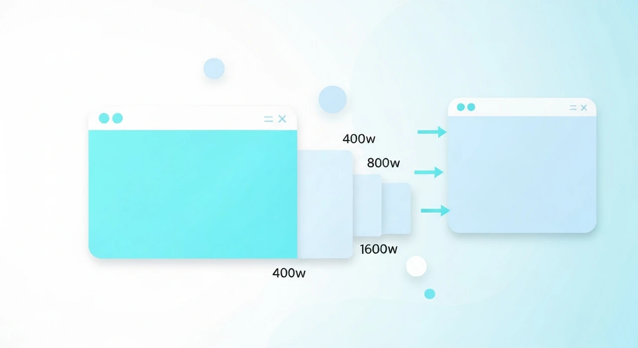
Resolution switching with srcset and sizes
The basic syntax:
<img
  src="photo-800.jpg"
  srcset="photo-400.jpg 400w, photo-800.jpg 800w, photo-1600.jpg 1600w"
  sizes="(max-width: 600px) 100vw, 800px"
  alt="A descriptive alt text"
  width="800"
  height="600"
  loading="lazy"
>
Breaking this down:
-
srcis the fallback. Used by browsers that don’t supportsrcset(practically none now, but the attribute is still required for the element to work). -
srcsetis a comma-separated list of candidates, each with its intrinsic width (the400w,800w,1600wdescriptors). These are the actual widths of the image files. -
sizestells the browser the displayed width of the image at each viewport condition. This lets the browser pick the rightsrcsetcandidate before it’s had a chance to compute layout.
Reading sizes like a browser
sizes is a list of media conditions, each paired with a length. The browser walks through left
to right and uses the first matching condition:
sizes="(max-width: 600px) 100vw, (max-width: 1200px) 50vw, 800px"
Means: “If the viewport is 600 pixels or narrower, this image displays at 100% of the viewport. If it’s 1200 or narrower, 50%. Otherwise, 800 pixels.”
The browser combines that with the device pixel ratio to pick a
srcset candidate. On a Retina phone with a 375 px viewport, the image displays at 100vw = 375
px, scaled 2× for retina = 750 px needed. The browser picks photo-800.jpg from the srcset.
What to put in sizes
The values should match your CSS. If your image displays at
width: 100% inside a container with max-width: 800px, the right
sizes is (max-width: 800px) 100vw, 800px.
If your CSS is doing anything complex with column widths or media queries, the sizes attribute
needs to mirror that structure. This is where responsive images get tedious, and it’s the reason many sites
ship dynamic markup generated by their build system.
What breaks if sizes is wrong
Nothing breaks visibly. The browser still picks a candidate and renders the image. But it may pick one that’s too big (wasting bandwidth) or too small (rendering soft).
Check with DevTools → Network tab: the actual URL loaded for each image tells you what the browser chose.
Art direction with <picture>
<picture> lets you swap different image files based on media queries. The original use
case was responsive design: showing a wide landscape crop on desktop and a tighter portrait crop on mobile.
<picture>
  <source media="(max-width: 600px)" srcset="hero-mobile.jpg">
  <source media="(max-width: 1200px)" srcset="hero-tablet.jpg">
  <img src="hero-desktop.jpg" alt="..." width="1600" height="900">
</picture>
Each <source> specifies a different image file for a specific viewport condition. The
<img> is the fallback for everything not matched.
You can combine this with srcset on each source for a 2D matrix (different art direction ×
different densities):
<picture>
  <source media="(max-width: 600px)"
          srcset="hero-mobile-400.jpg 400w, hero-mobile-800.jpg 800w"
          sizes="100vw">
  <source srcset="hero-desktop-800.jpg 800w, hero-desktop-1600.jpg 1600w"
          sizes="(max-width: 1200px) 100vw, 1200px">
  <img src="hero-desktop-800.jpg" alt="..." width="1600" height="900">
</picture>
This is powerful and verbose. Most sites don’t need it unless they’re actively art-directing different images per breakpoint.
Format switching with <picture>
The modern workhorse use of <picture> is serving different formats:
<picture>
  <source type="image/avif" srcset="hero.avif">
  <source type="image/webp" srcset="hero.webp">
  <img src="hero.jpg" alt="..." width="1600" height="900" loading="lazy">
</picture>
The browser picks the first <source> whose type it supports. Modern Chrome
grabs AVIF, Safari 14 grabs WebP, and anything older falls back to the JPEG <img>.
Combine this with srcset on each source and you’ve covered format and resolution in one
element:
<picture>
  <source type="image/avif"
          srcset="hero-400.avif 400w, hero-800.avif 800w, hero-1600.avif 1600w"
          sizes="(max-width: 600px) 100vw, 800px">
  <source type="image/webp"
          srcset="hero-400.webp 400w, hero-800.webp 800w, hero-1600.webp 1600w"
          sizes="(max-width: 600px) 100vw, 800px">
  <img src="hero-800.jpg"
       srcset="hero-400.jpg 400w, hero-800.jpg 800w, hero-1600.jpg 1600w"
       sizes="(max-width: 600px) 100vw, 800px"
       alt="..."
       width="800"
       height="600"
       loading="lazy">
</picture>
Yes, that’s verbose. In production you’d generate it from a template or helper function rather than writing it by hand.
The attributes everyone forgets
width and height
Always set them. Without these, the browser can’t reserve space for the image, which causes layout shift during load and tanks your Cumulative Layout Shift score.
The values should match the image’s intrinsic aspect ratio. CSS handles the display size. Modern browsers use the width/height to compute aspect ratio and reserve space accordingly.
loading="lazy"
For any image below the initial viewport, set
loading="lazy". The browser defers downloading until the image is near the viewport.
This saves bandwidth and improves LCP by not competing with above-the-fold resources.
Important: do NOT set loading="lazy" on your LCP image. See below.
fetchpriority="high"
For the image that is (or likely will be) the LCP element on the page — typically your hero — add
fetchpriority="high". This signals the browser to prioritize that request over other
images, scripts, and fonts.
<img src="hero.jpg"
     srcset="..."
     sizes="..."
     width="1600"
     height="900"
     alt="..."
     fetchpriority="high">
Pair with no loading="lazy" (so the image is eager) and you’ve done most of what you
can to make the hero render fast.
decoding="async"
Optional but cheap. Lets the browser decode the image off the main thread, improving responsiveness during load. Add to all non-LCP images:
<img ... decoding="async">
Patterns for common use cases
Blog post hero image
<picture>
  <source type="image/avif" srcset="hero.avif">
  <source type="image/webp" srcset="hero.webp">
  <img src="hero.jpg"
       alt="Descriptive alt text"
       width="1200" height="630"
       fetchpriority="high">
</picture>
No srcset with widths if the container is always the same size. The hero image is the LCP
candidate, so fetchpriority="high" and no lazy loading.
Blog post body image
<picture>
  <source type="image/avif" srcset="figure.avif">
  <source type="image/webp" srcset="figure.webp">
  <img src="figure.jpg"
       alt="Descriptive alt text"
       width="800" height="450"
       loading="lazy"
       decoding="async">
</picture>
Lazy-loaded, async-decoded, still serves the best format the browser supports.
Full responsive product gallery image
<picture>
  <source type="image/webp"
          srcset="product-400.webp 400w, product-800.webp 800w, product-1600.webp 1600w, product-2400.webp 2400w"
          sizes="(max-width: 600px) 100vw, (max-width: 1200px) 50vw, 800px">
  <img src="product-800.jpg"
       srcset="product-400.jpg 400w, product-800.jpg 800w, product-1600.jpg 1600w, product-2400.jpg 2400w"
       sizes="(max-width: 600px) 100vw, (max-width: 1200px) 50vw, 800px"
       alt="Matte black ceramic mug, front view"
       width="800" height="800"
       loading="lazy">
</picture>
Covers format, resolution, and art-aware sizing.
Tooling to generate this stuff
You don’t write the above markup by hand in production. Common generators:
-
Next.js
<Image>: handles everything above, though with its own opinions. -
Astro
<Image>: similar, with build-time generation. -
Eleventy’s
eleventy-imgplugin: excellent for static sites. - Gatsby’s gatsby-image / gatsby-plugin-image.
-
WordPress’s native
<img>output with plugins like “Modern Image Formats” adds<picture>automatically. - Cloudflare Images: serves the right format and size per request via URL parameters.
If you’re on a custom stack, sharp in Node or vips from the shell can generate all
the variants at build time. Pair with a template helper that emits the right markup.
Common mistakes
-
Using
srcsetwithoutsizes, which silently makes the browser pick suboptimal candidates. - Using
sizesthat don’t match the actual CSS display width. - Setting
loading="lazy"on the hero image, which delays LCP. -
Using a single
<source>in<picture>and expecting graceful fallback (you need at least the<img>tag inside). - Forgetting
widthandheight, causing CLS. - Generating a responsive image set but shipping only the largest variant because the CSS is wrong.
The bottom line
The modern responsive-image stack is verbose but mechanical. Once you’ve set it up correctly, it handles format switching, resolution switching, and art direction in a single element that works across every modern browser.
The recipe for 90% of cases:
- Use a
<picture>for format switching (AVIF → WebP → JPG). -
Use
srcset+sizesinside the<img>(and on each<source>) for resolution switching. - Always set
widthandheight. -
Add
fetchpriority="high"to the LCP image,loading="lazy"to everything below the fold. -
Generate variants at build time with
sharp,vips, or your framework’s image helper.
For one-off variant generation, our
PNG-to-WebP converter and
JPG compressor handle format
conversion in the browser. For a full pipeline, automate with sharp so every image upload
produces the full responsive set.
Try our free image tools
Compress and convert images right in your browser. No upload, no signup, no limits.