E-commerce
How to Prepare Product Photos That Actually Convert
Beyond file size: the photography, editing, and cropping choices that turn product shots into purchases.
A product photo’s job isn’t to look pretty. Its job is to convince someone to buy. Those are not the same thing, and most e-commerce product photography optimizes for the first at the expense of the second.
This article is about the parts of product photography that actually move revenue. It’s a sibling to our Shopify / WooCommerce optimization guide, which focuses on the technical side of delivery. Here I’ll cover the content and composition side: what makes a product photo make people click “Buy.”
I run a small product-photography practice on the weekends alongside my writing work, and I’ve shipped photo sets for everything from hand-thrown ceramics to industrial electronics. The patterns that convert are surprisingly consistent across categories.
The core job: answer the buyer’s questions
Every buyer arriving at a product page has a silent checklist. They’re asking, in rough order:
- What exactly am I looking at?
- What scale is this?
- What does it look like from other angles?
- How does it look in use or in context?
- What’s the material and finish?
- Are there any details I’d want to inspect closely?
- Does this match what I saw elsewhere (Instagram, a friend’s photo)?
Your photo set should answer each of those, in that order. If a question goes unanswered, the buyer hesitates, and hesitation kills conversion.
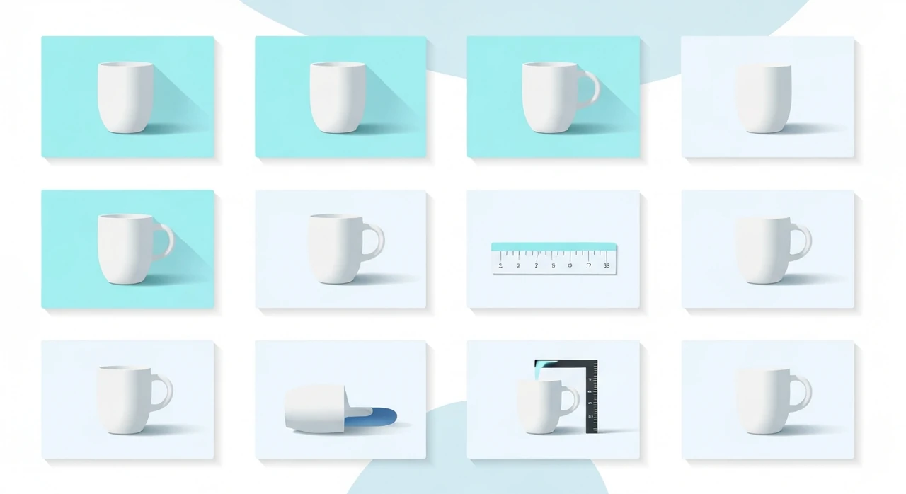
The seven-shot set that covers most products
For most physical goods, we aim for a standard set of seven images:
1. Hero shot on clean background
- Pure white (#FFFFFF) or a neutral gray.
- Product centered, with some breathing room on all sides.
- Shot at the product’s most characteristic angle (not always straight-on).
This is the thumbnail the buyer sees in search results and category pages. It needs to be instantly identifiable.
2. Scale reference
- Product next to something familiar: a hand, a coffee cup, a ruler.
- For very small or very large products, this shot prevents buyers from being surprised when the package arrives.
Returns for “smaller than expected” or “bigger than expected” are a real cost. One scale reference shot reduces that return rate measurably.
3. Alternate angle (three-quarter or profile)
- Shows the depth and shape that the hero shot flattens.
- Often the most useful shot for furniture, footwear, and anything with three-dimensional form.
4. Back / underside
- Hardware stores, electronics retailers, and anyone selling something with inputs, ports, or screws absolutely needs this shot.
- For apparel, this is the back view.
5. Detail / macro
- Close-up on the most distinctive feature: stitching, grain, texture, a logo.
- This is where quality perception gets built or destroyed. If the macro shot shows loose threads or plastic flash, nothing else matters.
6. In use / in context
- Person wearing, using, or interacting with the product.
- Lifestyle photography that shows scale, use case, and aspiration in one shot.
This shot is usually the most expensive to produce (you need a person, a location, props, styling) but also the highest-converting single image after the hero.
7. Packaging or presentation
- Especially for gift-suitable products, skincare, and anything meant to be unboxed.
- Optional for utilitarian goods.
Seven is a target, not a rule. Luxury goods often have 10–15. Commodity items may get away with four. But the concept — “every shot earns its place by answering a specific question” — applies regardless of category.
Framing, crop, and composition
Square hero, rectangular context shots
- Square (1:1) works everywhere: thumbnails, Instagram, product galleries. Use it for the hero.
- Landscape (3:2 or 4:3) gives more room for lifestyle and in-use shots.
- Portrait (2:3) suits apparel and vertical products.
Leave margin around the product
Don’t crop tight to the product in the hero. A 10–15% margin on each side makes the shot look considered rather than cramped, and allows the buyer’s eye to settle.
Keep the vertical straight
Slight tilt in product photos reads as unprofessional. Use a bubble level on your camera or straighten in post. Every shot should have obvious vertical lines perfectly vertical.
Mind the edges
Crop decisions matter more than they look. A product shot with 80% of the product in frame and 20% cut off at the edge often converts worse than a pulled-back shot showing the entire product with space around it. Buyers want to see the whole thing.
Lighting that makes materials look real
Lighting is the biggest factor separating amateur product photography from professional work. Three foundational patterns:
Two softbox setup (most products)
- One softbox as the key light, 45 degrees to the product, slightly above.
- Second softbox (or white reflector) on the opposite side at 45 degrees, two stops less brightness.
- This creates natural-looking shadows that show shape without being harsh.
Backlight for translucency (glassware, skincare)
- Main light coming from behind the product, diffused through a white panel.
- Fill light from the front.
- Reveals the material’s translucency, which is the main selling point for those products.
Window light for lifestyle
- Shoot near a north-facing window (or any large window in diffused natural light).
- No direct sun; it’s too harsh for product work.
- This looks expensive without expensive equipment.
Avoid top-down ceiling light
Direct overhead light (common in home office setups) flattens shape, creates unflattering shadows under products, and makes colors look off. Either move to window light, get an inexpensive softbox, or shoot outdoors in open shade.
Editing that doesn’t lie
The line between “clean editing” and “misleading editing” matters for returns, reviews, and platform policy compliance.
Fair game:
- White-balance correction to neutral.
- Exposure lift to show the product clearly.
- Background cleanup (dust, spots, minor stray fibers).
- Color calibration to match real-world appearance.
Not fair game:
- Heavy skin smoothing on lifestyle shots that changes perceived skin tone.
- Saturating colors beyond what the real product shows.
- Removing features (scars on handmade goods, grain variation in wood) that affect the buyer’s expectations.
Returns caused by “it didn’t look like this” are expensive and leave a trail of bad reviews. Edit toward accurate, not toward idealized.
Color consistency
Across a product set, colors need to match. If the hero shows a warm beige and the detail shot shows a cool gray for the same fabric, buyers get confused. A few practices:
- Calibrate your monitor. Even a basic X-Rite i1 Display makes a visible difference.
- Shoot with a color-reference card in the frame for at least one shot, then use that to set white balance for the rest.
- Export all variants from the same edit preset.
- Check the final exports on a phone screen as well as your calibrated monitor. Colors that look perfect on calibrated desktop often look off on mobile.
Platform-specific sizing
Each platform has its own quirks. The full breakdown is in our social media sizing guide, but for e-commerce product galleries specifically:
- Shopify main product image: 2048×2048 px.
- WooCommerce product image: depends on theme, but 1600 px on the long side is usually enough.
- Amazon: requires 1000 px on the longer side minimum, 1600 px recommended. Pure white background.
- Etsy: 2000×2000 px recommended.
- Instagram shopping: 1080×1080 for feed posts that also show in the Shop tab.
Upload once at the largest required size; let the platform generate the rest.
File naming and alt text for SEO
Each product image should have:
-
A file name that describes the product:
matte-black-ceramic-mug-front-view.jpg. - Alt text that describes what’s actually in the photo: “Matte black ceramic mug with cream interior, viewed from the front.”
See our image SEO guide for the full approach. The short version: descriptive beats clever.
What to do before you’re ready to hire a photographer
If you’re a small brand that can’t afford professional photography yet, here’s the DIY setup that produces surprisingly good results:
- A large north-facing window for diffused daylight.
- White foam board (at the hardware store, $5) as a reflector.
- A sheet or large roll of white paper as a seamless background.
- A phone camera (iPhone 13+ or a modern Pixel / Samsung) shooting in Pro / RAW mode.
- Lightroom Mobile or Snapseed for editing.
- A tripod or even a stack of books to keep the phone steady.
That setup, used with the shot list above, will cover 80% of what you need for a first product launch. You can upgrade to lights, lenses, and a dedicated camera later.
The bottom line
Converting product photography isn’t about gear or Photoshop wizardry. It’s about answering the buyer’s questions with seven well-chosen shots:
- Hero on clean background.
- Scale reference.
- Alternate angle.
- Back/underside.
- Detail macro.
- In-use lifestyle.
- Packaging (optional).
Light cleanly, crop consistently, edit toward accuracy, and export at the right sizes for each platform. Then run the final exports through our JPG compressor and PNG-to-WebP converter to keep pages fast.
Do all of that and your product pages will outperform the majority of your category’s competition, not because the photos are more beautiful, but because they do a better job answering the silent checklist every buyer arrives with.
Try our free image tools
Compress and convert images right in your browser. No upload, no signup, no limits.